本文标签: EasyUI easyui api web开发
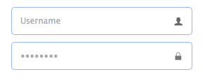
TextBox
扩展自 $.fn.validatebox.defaults. 重写 $.fn.textbox.defaults.
TextBox 是加强的输入控件,使我们建设表单更加快捷. 是一些复杂控件的基础控件,比如 combo,datebox,spinner,等等.
依赖
- validatebox
- linkbutton
实例
html创建方式
<input class="easyui-textbox" data-options="iconCls:'icon-search'" style="width:300px">
javascript创建方式
<input id="tb" type="text" style="width:300px">
$('#tb').textbox({
 buttonText:'Search',
 iconCls:'icon-man',
 iconAlign:'left'
})
属性
属性拓展自 validatebox 控件,下面是textbox新添加的属性:
| Name | Type | Description | Default |
|---|---|---|---|
| width | number | The width of the component. | auto |
| height | number | The height of the component. | 22 |
| prompt | string | The prompt message to be displayed in input box. | '' |
| value | string | The default value. | |
| type | string | The textbox type. Possible values are 'text' and 'password'. | text |
| multiline | boolean | Defines if this is a multiline textbox. | false |
| editable | boolean | Defines if user can type text directly into the field. | true |
| disabled | boolean | Defines if to disable the field. | false |
| readonly | boolean | Defines if the component is read-only. | false |
| icons | array |
The icons attached to the textbox. Each item has the following properties: iconCls: string, the icon class. disabled: boolean, indicate if the icon is disabled. handler: function, the function to process the clicking action on this icon. Code example: $('#tb').textbox({
icons: [{
iconCls:'icon-add',
handler: function(e){
$(e.data.target).textbox('setValue', 'Something added!');
}
},{
iconCls:'icon-remove',
handler: function(e){
$(e.data.target).textbox('clear');
}
}]
})
|
[] |
| iconCls | string | The background icon displayed on the textbox. | null |
| iconAlign | string | Position of the icons. Possible values are 'left','right'. | right |
| iconWidth | number | The icon width. | 18 |
| buttonText | string | The displaying text of button that attached to the textbox. | |
| buttonIcon | string | The displaying icon of button that attached to the textbox. | null |
| buttonAlign | string | Position of the button. Possible values are 'left','right'. | right |
事件
事件拓展自 validatebox 控件,下面是textbox新添加的事件:
| Name | Parameters | Description |
|---|---|---|
| onChange | newValue,oldValue | Fires when the field value is changed. |
| onResize | width,height | Fires when the textbox is resized. |
| onClickButton | none | Fires when the user click the button. |
| onClickIcon | index | Fires when the user click a icon. |
方法
方法拓展自 validatebox 控件,下面是textbox新添加的方法:
| Name | Parameter | Description |
|---|---|---|
| options | none | Return the options object. |
| textbox | none | Return the textbox object. |
| button | none | Return the button object. |
| destroy | none | Destroy the textbox component. |
| resize | width | Resize the component width. |
| disable | none | Disable the component. |
| enable | none | Enable the component. |
| readonly | mode |
Enable/Disable readonly mode.
Code example: $('#tb').textbox('readonly'); // enable readonly mode
$('#tb').textbox('readonly',true); // eanble readonly mode
$('#tb').textbox('readonly',false); // disable readonly mode
|
| clear | none | Clear the component value. |
| reset | none | Reset the component value. |
| setText | text | Set the displaying text value. |
| getText | none | Get the displaying text value. |
| setValue | value | Set the component value. |
| getValue | none | Get the component value. |
| getIcon | index | Get specified icon object. |
FileBox
拓展自 $.fn.textbox.defaults. 重写 $.fn.filebox.defaults.
由于浏览器安全问题, 一些方法 比如 'setValue' 不能使用filebox 组件.

依赖
- textbox
实例
html创建方式
<input class="easyui-filebox" style="width:300px">
javascript创建方式
<input id="fb" type="text" style="width:300px">
$('#fb').filebox({
 buttonText: 'Choose File',
 buttonAlign: 'left'
})
属性
属性拓展自 textbox, 下面是 filebox新增属性.
| Name | Type | Description | Default |
|---|---|---|---|
| buttonText | string | The displaying text of button that attached to the textbox. | Choose File |
| buttonIcon | string | The displaying icon of button that attached to the textbox. | null |
| buttonAlign | string | Position of the button. Possible values are 'left','right'. | right |
事件
事件拓展自 textbox.
方法
方法拓展自 textbox.
web开发分享
声明: 本文由( zongyan86 )原创编译,转载请保留链接: EasyUI1.4 新控件TextBox,FileBox

